Grinderman 2 album redesign. Experimental Image Making Processes
The Grinderman 2 album tracks are self-depreciating, with reference to their aging bodies – it is often darkly humorous. Recurring themes include love, lust, God, and Godlessness, with lusty lupine howls that punctate the album tracks. In the background is a full-on assault on all the senses by layers of psychedelic sound, created with vocals, wild guitar, and exotic instruments such as the bouzouki.
The existing cover of the Grinderman 2 album is a snarling wolf in an opulent marble-clad bathroom, the only type is the word “Grinderman” in gothic script at the top of the cover. The design comes across as perfunctory, rather than considered. The motivation to redesign this album was to address the overarching themes of the music, the psychedelic, the love and lust. The target audience is easy. Any Nick Cave and the Bad Seeds fan would buy the album, their fan base overlaps demographics (from ‘Gen Z’ to baby boomers). The audience does not necessarily care about the external artwork – they are concerned with the music.
Constructing a new artwork from a Rorschach image had appeal, given the synonymous concepts of love, lust and a howling wolf. The colour red, so long associated with the colour of love, was painted with oil paint on the first half of the image; the more overt “original” wolf, howling for love, and companionship. The second half was painted blue, a colour associated with lust dating back to the 7 deadly sins, referencing the bible and God. By creating a Rorschach image, the second half of the wolf appears to be decaying. Interestingly the decaying second image has not been touched directly by a paintbrush, complicating the idea of the “artist’s hand” in the creation of an artwork as well as showing the degradation of lust, howling for sex and sleaze. The intentional transfer of the thickly applied blue paint and the minimal transfer of red paint to the blue canvas was intentional, creating a yin-yang effect, the love can turn to lust and vice vera. The chromosteropsis effect created by the strong red/ blue contrast was further enhanced by using the same red and blue colours as contrasting type for the tracklist.
The front and back artwork of the record picked up the psychedelic theme by utilising the wolf halves and creating kaleidoscopic artworks via Photoshop from each, the result was unexpected and ethereally beautiful, with multiple delicate layers and depth. The record title is incorporated into the design, subtle but strong, camouflaged and not competing with the intricate detail.
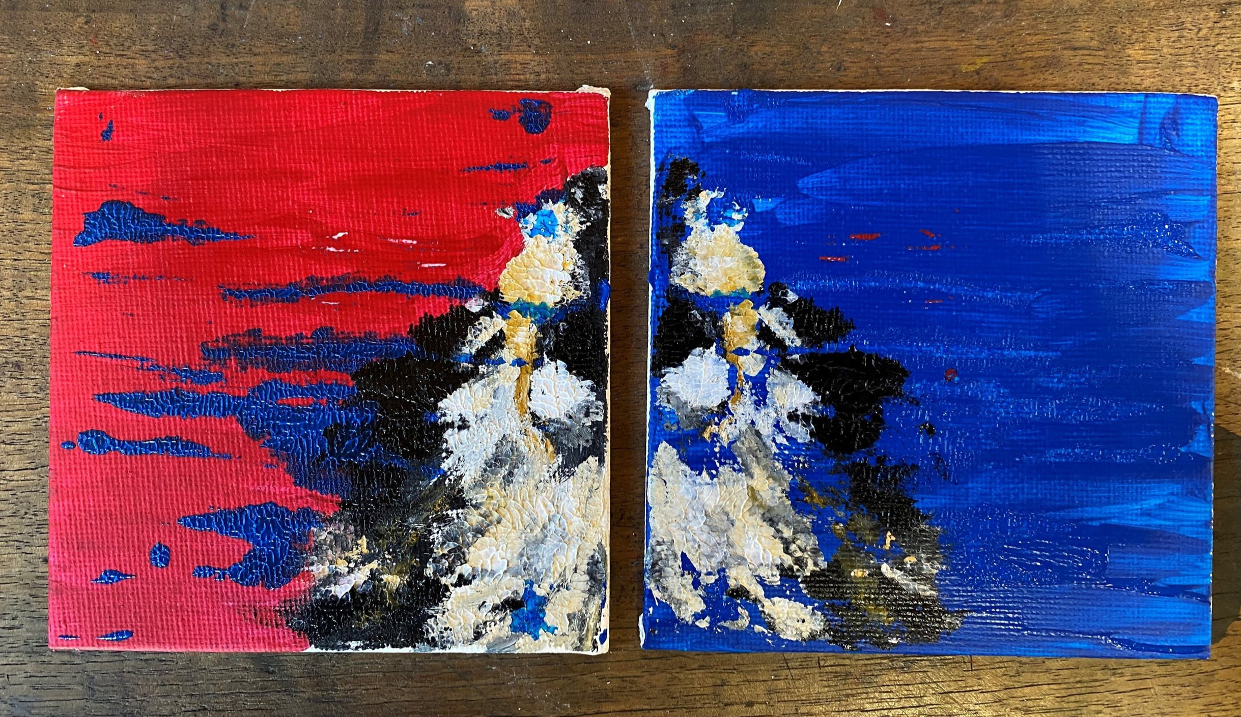
Design development, showing the Rorschach effect for the wolf idea
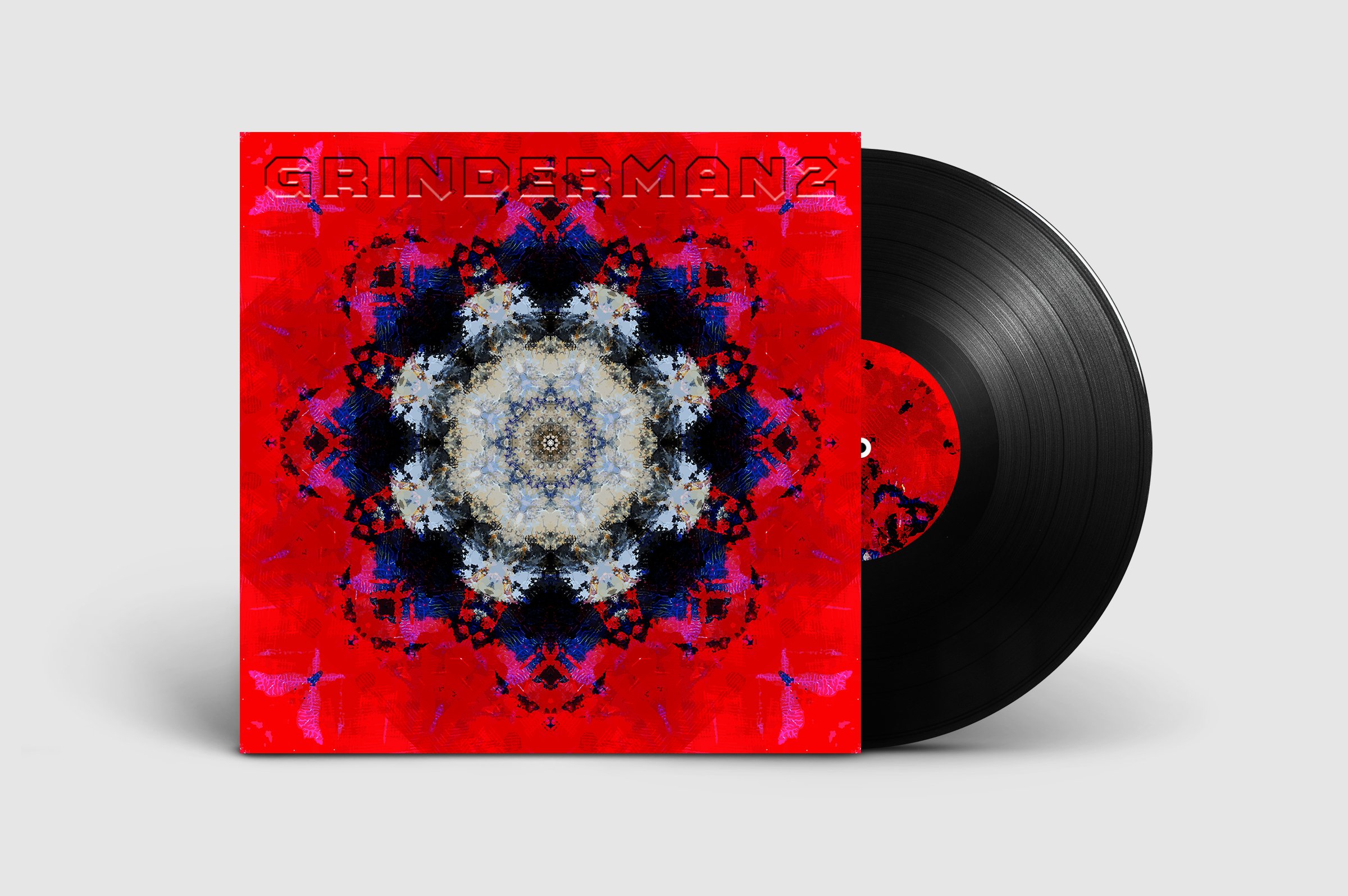
The redeveloped front cover concept for Grinderman 2
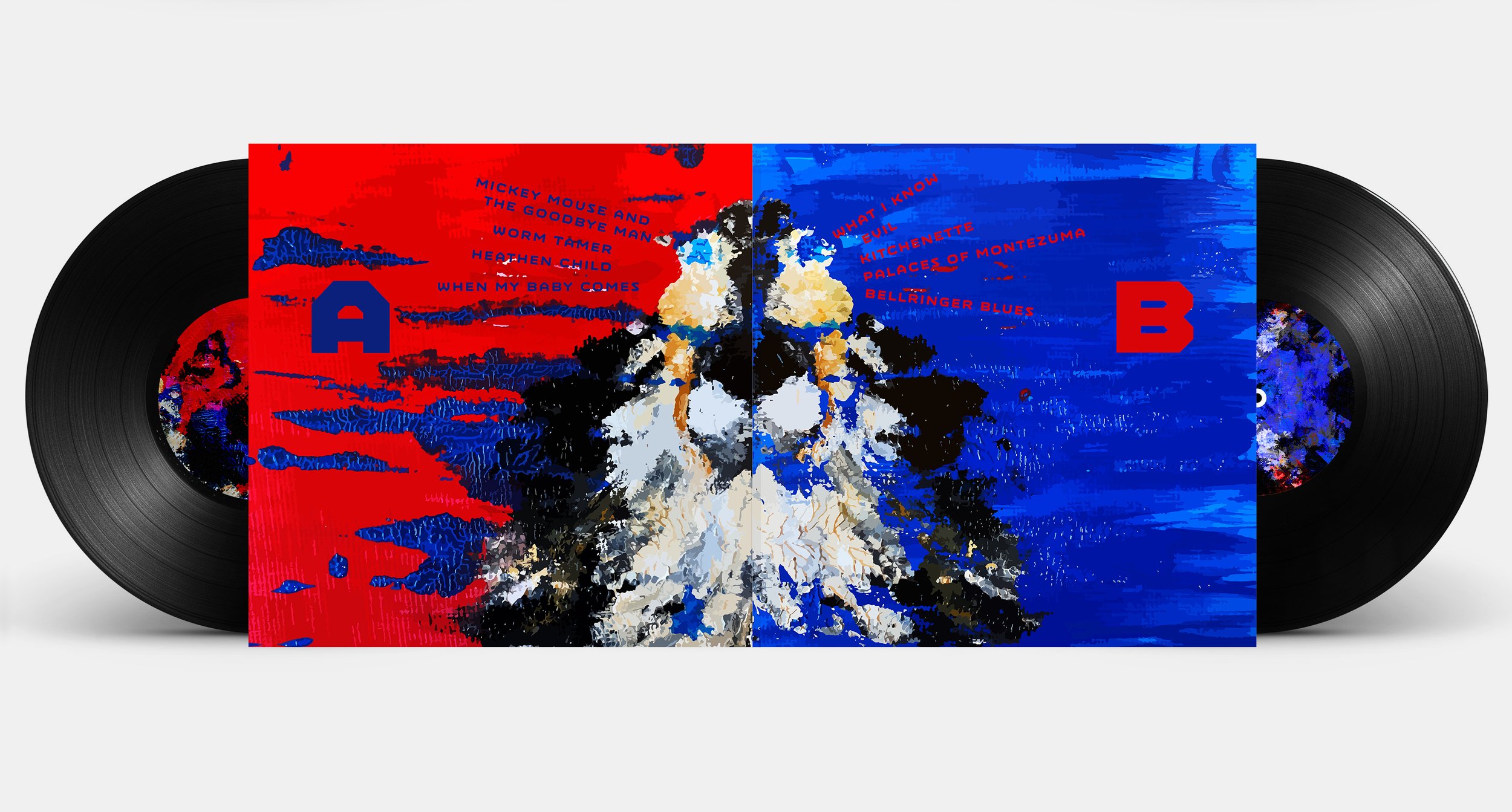
Inside gatefold
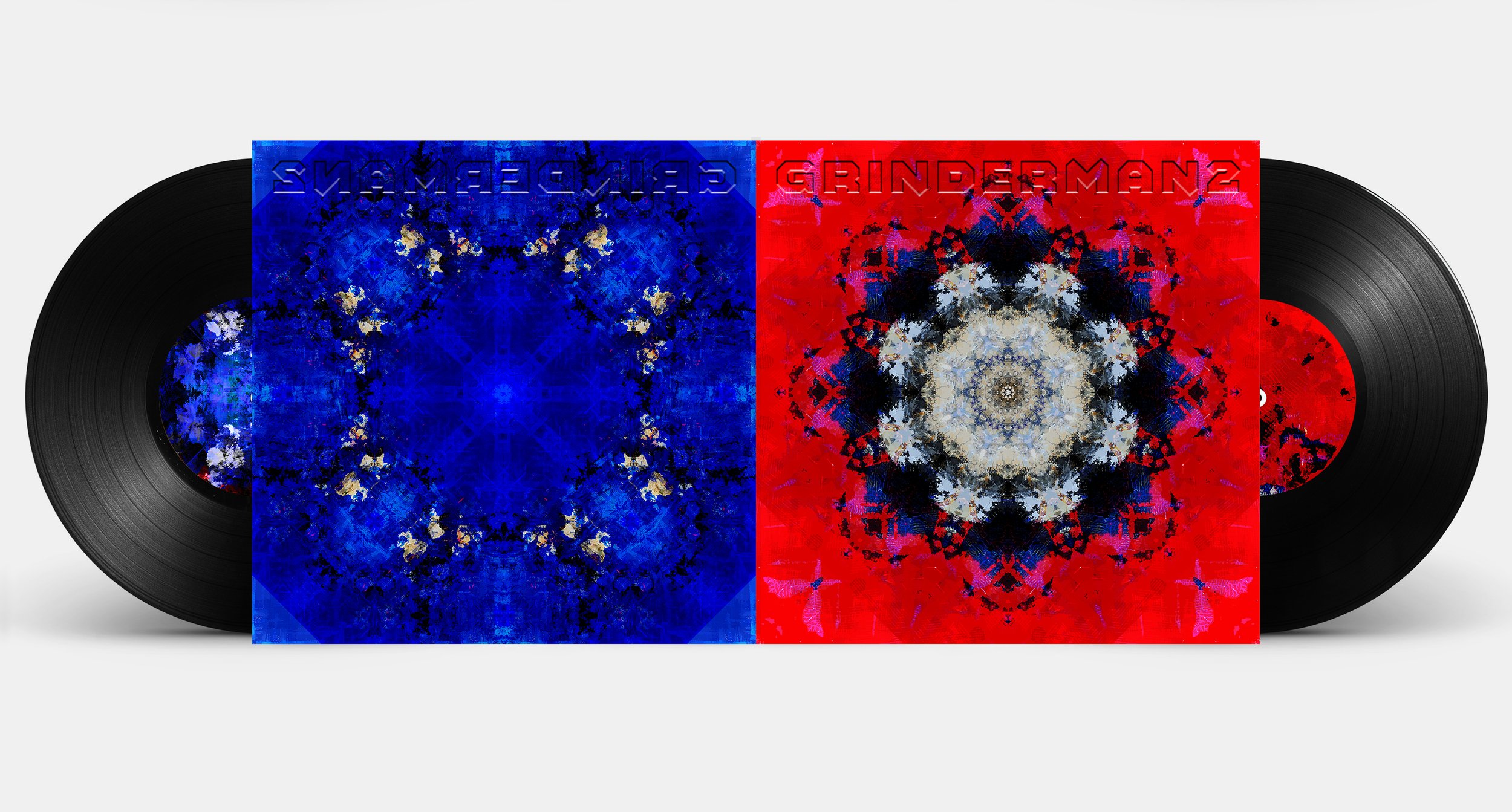
front and back album covers
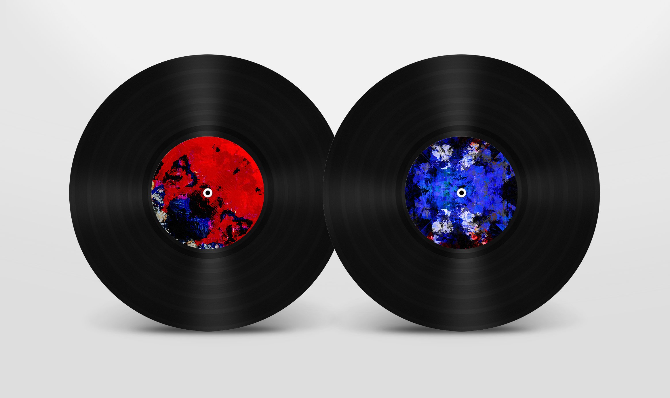
record label design

